Take a look - - -

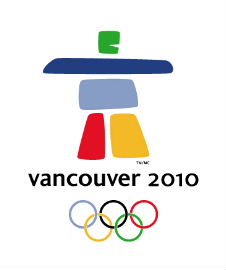
Ilanaaq
The guy seems to be shouting, "Look out!" Well, they are saying it means 'friend' too. Maybe it means, "Stay away friend, you'll get ripped off here."? They say it represents all of Canada. Seems to look like that clunky stone guy in Sinbad the Sailor. Not too athletic.
There are no Inuit tribes in BC.
Here is the old logo - - -

Bid logo
Do you see a Maple Leaf? Canada. Do you see the sea? Do you see white capped mountains? Sea to Sky. Do you see flowing motion? Do you see British Columbia vibrancy?
Which do you like better?
Hmmmm .... Well doesn't this Inuit logo once again PROVE that Gordon Campbell and his cronies are totally AGAINST British Columbians? He awarded Mexicans the winning design logo representing the Arctic Territories. Why doesn't he just ban BCers from competing in everything?
Wait a minute .... I think he has ...
I saw the woman who talked about it, they are Mexicans. Surprised we didn't get an INca design. Isn't there enough indians in BC for a great design?
ReplyDeleteThe designers said they went to English Bay and saw the design. That stone monument is from the Northwest Territories pavillion at Expo 86? What have they got to do with Olumpic games 2010?
ReplyDeleteAre the olympics in the artic?
ReplyDeleteit's all a scam you know. Outsiders are running everything in BC. That's why they don't know what is what here.
ReplyDelete